How to use Markup: The best website feedback tool

MarkUp is a game-changer in today’s fast-paced digital world, making effective communication between teams more seamless and efficient than ever. It is a powerful web feedback tool, changing how developers, designers, and stakeholders collaborate. By enabling real-time comments and annotations directly on websites and digital assets, MarkUp simplifies the feedback process, enhancing productivity and ensuring that projects stay on track. This guide explores best practices for using MarkUp, ensuring that your web projects run smoothly from inception to completion. Whether you're a seasoned web developer or a project manager navigating the complexities of digital feedback, these tips will help you leverage MarkUp to its fullest potential.
Navigating MarkUp
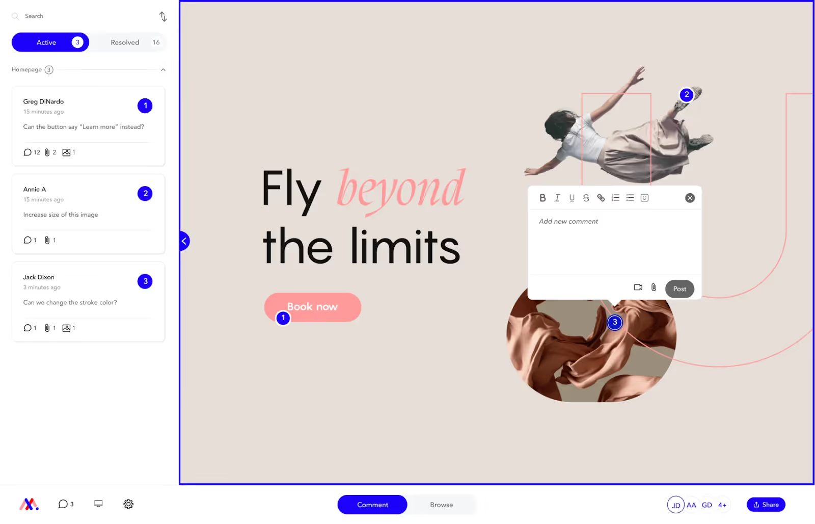
Navigating MarkUp can initially seem complex, but understanding its modes will streamline your experience. At the top of the screen, you will see two modes: Comment Mode and Browse Mode.
Comment Mode is designed for leaving comments and feedback on specific elements of the website. This mode is essential for providing detailed insights, highlighting issues, and suggesting improvements directly on the web page. Users can click on any part of the site to leave a comment, making it easy to address specific sections or features. This targeted feedback ensures that developers and designers can quickly identify and address issues, leading to a more efficient workflow.
Browse Mode, on the other hand, lets users navigate through the site and its pages without leaving comments. This mode is perfect for reviewing the overall structure and flow of the website, ensuring that all pages and links function correctly. By simply switching to Browse Mode, users can experience the site as an end-user would, checking for navigation ease and overall user experience. This holistic review process helps in identifying any usability issues that might not be apparent in Comment Mode.
By switching between these two modes, you can efficiently review and provide feedback on your web projects, making the collaboration process seamless and productive. Understanding when to use each mode will help you maximize the benefits of MarkUp, ensuring that your team can deliver high-quality web projects on time. Whether you're providing detailed feedback or reviewing the site as a whole, MarkUp's dual-mode functionality is designed to support your needs.
Be Specific
- When leaving a comment in MarkUp, specificity is key to effective communication and collaboration. To ensure each comment is clear and actionable, include three essential elements: Reference, Issue, and Desired Outcome.
- Reference: Clearly state what you are referring to. This could be a specific section of text, an image, a button, or any other element on the page. By providing a precise reference, you help others quickly identify the area in question, reducing the chances of misunderstandings.
- Issue: Describe what is wrong. Whether it's a typo, a broken link, a design flaw, or any other problem, a detailed description of the issue helps the team understand the nature of the problem. This step is crucial for prioritizing tasks and ensuring that nothing is overlooked during the revision process.
- Desired Outcome: Specify the desired function, content, or location. Instead of merely pointing out problems, offer solutions or suggestions for improvement. Whether you're recommending a new piece of content, a different design approach, or a functionality tweak, clearly stating your desired outcome ensures that your feedback is constructive and actionable.
- By following these guidelines, you can provide precise and helpful feedback, making the most of your collaboration with MarkUp. This approach not only streamlines the revision process but also fosters a more productive and positive working environment for everyone involved.

Fully Embrace MarkUp
MarkUp offers extensive functionality that can greatly enhance your feedback process. By fully embracing its features, you can ensure that your comments are comprehensive and actionable. Here are some key functionalities to leverage:
- Add links, images, files, and videos within a comment. This feature allows you to provide context and additional information directly within your feedback. For example, you can link to relevant resources, attach images to illustrate a point, or include videos that demonstrate an issue or desired outcome. This multimedia approach makes your comments more informative and easier to understand.
- Include necessary files directly in your comments to facilitate issue resolution. If a specific document, design file, or piece of code is needed to address a comment, you can attach it directly within your feedback. This ensures that all relevant materials are readily available, streamlining the resolution process and reducing back-and-forth communication.
By utilizing these features, you can make your feedback on MarkUp more effective and efficient. Embracing the full range of MarkUp's capabilities not only enhances your ability to communicate but also fosters a more collaborative and productive environment. This thorough approach to feedback helps ensure that projects stay on track and that all team members have the information they need to make informed decisions.
New Content
When using MarkUp to send a new copy, it's important to ensure that your text fits seamlessly within the existing design. Matching the amount of text available in the design is crucial for maintaining visual balance and coherence. Here are some tips to achieve this:
First, review the design to understand the space allocated for text. This might include character limits, line breaks, or specific formatting requirements. By understanding these constraints, you can craft your copy to fit perfectly within the designated areas, ensuring a clean and professional appearance.
Next, write your new content with these constraints in mind. Be concise and clear, using precise language to convey your message without exceeding the space provided. If necessary, edit your copy to eliminate unnecessary words or phrases, making sure every word counts. This not only helps with fitting the text but also enhances readability and impact.
Finally, preview your new copy within the design before submitting it. This allows you to make any final adjustments to ensure a perfect fit. By taking the time to match the amount of text available in the design, you can create a polished and cohesive final product that aligns with the visual and functional goals of the project.
By following these steps, you can effectively use MarkUp to send new copy that integrates smoothly into the design, enhancing the overall quality and effectiveness of your web projects.
One Voice
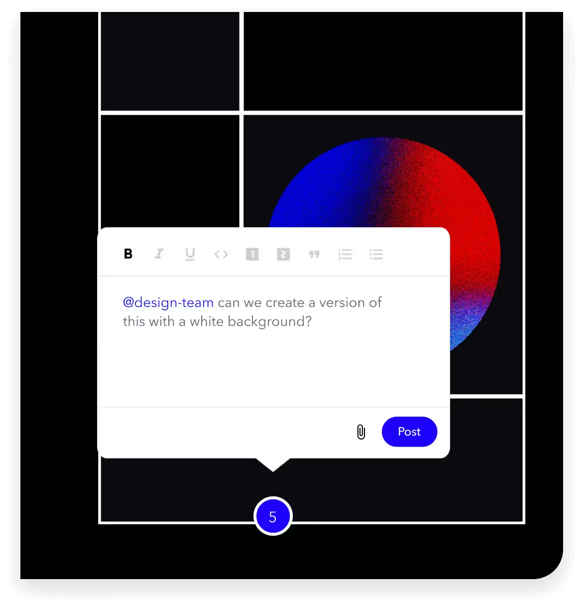
MarkUp is designed for clear and concise feedback, not for team discussions. Once your review is complete, developers will use the comments to make changes. To avoid confusion and ensure a streamlined process, it's important to maintain a single, unified voice in your feedback.
Having multiple voices can create confusion and make it difficult for developers to understand and prioritize the feedback. Therefore, designate one person or a small team to consolidate all comments before they are submitted. This helps to ensure that all feedback is clear, actionable, and consistent.
Make sure each comment is specific and detailed, providing enough information for developers to understand the issue and the desired outcome. Avoid using vague or ambiguous language that could lead to misinterpretation. Instead, be precise and thorough, outlining exactly what needs to be changed and why.
By maintaining one voice and ensuring that all comments are clear and actionable, you can help streamline the feedback process, making it easier for developers to implement changes efficiently. This approach not only reduces the risk of misunderstandings but also enhances the overall productivity and effectiveness of the team.
Glitches
MarkUp is a powerful tool for feedback, but it's important to remember that it is not always definitive for website behavior. If something looks off, especially on mobile devices, it's crucial to verify the issue on another device or tab before commenting.
Sometimes, glitches or display issues can be specific to a particular browser or device. By checking the website on multiple platforms, you can determine if the problem is consistent or just an isolated incident. This step helps to avoid unnecessary comments about issues that may not actually exist.
When you do identify a genuine issue, provide detailed feedback in your comment. Specify the device, browser, and any other relevant details to help developers understand and replicate the problem. This precise information is invaluable for troubleshooting and ensures that the right changes are made.
By taking the time to verify issues before commenting, you can provide more accurate and useful feedback through MarkUp. This careful approach helps maintain the quality of your reviews and supports the development team in addressing real problems effectively.

Conclusion
MarkUp is an invaluable tool for enhancing web project collaboration and feedback. By understanding its modes, being specific in your comments, fully embracing its functionality, and maintaining a unified voice, you can streamline the feedback process and improve project outcomes. Always ensure your new content fits within the design constraints and verify any glitches on multiple devices to provide accurate feedback. By following these best practices, you can maximize the effectiveness of MarkUp, ensuring your web projects are completed efficiently and to the highest standard. Happy collaborating!

.svg)
.svg)
%20(1)%20(1)%20(1).jpg)
.jpg)
%20(1).avif)
.avif)
.avif)


